
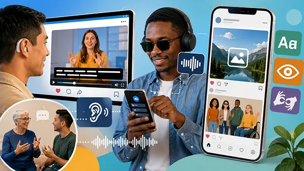
Accessible Social Media Content: Videos, Images and Posts for People with Sight or Hearing Loss
Accessible social media content allows people to understand a message even when they cannot see every visual detail, hear the soundtrack or use a screen in the way the creator expected. In 2026, this is no longer a specialist concern reserved for large organisations. A local business, charity, public body, publisher or independent creator can remove many common barriers through careful planning, accurate captions, useful image descriptions and clearer writing. The strongest approach begins before publication: decide what information the audience must receive, then make sure that information is available through more than one sense. A video should still make sense without sound, an image should not carry essential information that is absent from the text, and a post should remain readable when a screen reader announces it aloud. These choices improve access for blind and partially sighted people, Deaf people, people who are hard of hearing and many others who read in noisy places, use older devices, speak English as an additional language or need more time to process information.
Make Every Video Understandable With or Without Sound
Start by treating the spoken track, visual action and on-screen text as three separate sources of information. A viewer who cannot hear the audio needs accurate captions for speech and meaningful sounds, while a viewer who cannot see the screen may need the presenter to say what is happening rather than relying on gestures, charts or captions alone. This does not require a formal narration in every short clip. Often, a creator can make the main audio naturally descriptive by saying, “The red line rises from 20 to 45 per cent,” instead of “As you can see, this goes up.” Names, prices, dates, instructions and warnings shown on screen should also be spoken or repeated in the post copy. When essential information appears in only one format, part of the audience is forced to guess or leave.
Captions should reproduce the meaning of the full audio, not merely the dialogue. They need correct spelling, punctuation and timing, together with useful labels such as “[door closes]”, “[applause]” or “[quiet music]” when those sounds affect the scene. Speaker names are important when two or more voices are not visually obvious. Keep each caption on screen long enough to read, avoid covering faces or important graphics, and break sentences at natural points rather than dividing names or phrases between frames. Automatic speech recognition can provide a useful first draft, but it often mishears accents, product names, technical terms and speech recorded in noisy rooms. Publishing unedited automatic captions can replace one barrier with another, so every line should be checked against the final audio.
Audio description gives blind and partially sighted viewers access to visual information that is not already clear from the soundtrack. It can identify a speaker, describe an action, explain a change of scene or read important text during pauses in speech. For a short social video, the simplest method is usually to write the script so that the speaker includes these details in the main narration. Longer demonstrations, interviews or campaign films may justify a separate described version or an additional audio track where the service supports one. A text transcript is also valuable because it brings speech, meaningful sounds and visual explanations into one readable document. It helps people who use braille displays, cannot play audio, prefer to scan information or need to quote a particular passage.
A Practical Caption and Audio Workflow
Accessibility is easier when it is included in production rather than added minutes before publication. Write a short script or speaking outline, mark any information that will appear only visually, and decide how it will also be spoken or described. Record in a quiet space with the microphone close to the speaker, because clear sound improves both human transcription and automatic captioning. Leave brief pauses around important visual changes so there is room for description. When editing, check that on-screen wording remains visible long enough and is not placed behind interface elements that may appear along the bottom or sides of a mobile screen. This simple preparation reduces correction time and usually produces a more focused video for the whole audience.
After generating captions, review them while listening to the audio from beginning to end. Correct names, numbers, specialist terms and punctuation, then check that the timing matches the speaker. Watch once with the sound turned off: the message, tone and essential sound cues should still be clear. Next, listen without looking at the screen. Any important action, chart result, demonstration step or text that becomes impossible to understand needs a spoken explanation or written alternative. These two checks are quick, practical and more revealing than looking only at a caption file. They show whether the content truly works through different routes rather than merely containing an accessibility feature.
Choose closed captions when viewers should be able to switch captions on and adjust their display, and consider open captions when a social network does not show closed captions reliably in every placement. Open captions are permanently embedded in the picture, so they must use a readable typeface, strong contrast and enough space around the words. They should not be the only option for a long video if a separate caption file can be provided, because fixed text cannot be enlarged or restyled by the viewer. For live sessions, arrange real-time captioning in advance, brief the captioner on names and vocabulary, and tell viewers how they can request support. After the event, correct the recording’s captions and publish a transcript rather than leaving temporary live text as the final version.
Describe Images Without Overloading the Reader
Alternative text, often called alt text, gives a screen reader a concise replacement for an image. Its job is not to catalogue every visible object. It should communicate the information or purpose that the image adds in that particular post. A photograph used to announce a new shop may need the shop name, location and opening date if those details are visible only in the picture. The same photograph in a personal story may need a brief description of the people and atmosphere instead. Context changes the correct wording. Before writing, ask what a sighted reader learns from the image that is not already available in the surrounding copy. The answer usually forms the core of a useful description.
Decorative images do not need a repeated verbal description when they add no information and the nearby text already provides the full message. Repeating the same sentence in the post and alt text makes screen-reader users hear it twice. At the other extreme, charts, diagrams, infographics and screenshots often need more detail than an alt-text field can comfortably hold. Give these images a short identifying description, then place the important figures, trends, instructions or relationships in the main post, a linked article or a clearly labelled long description. The aim is equal access to the meaning, not an exhaustive inventory of colours and shapes.
Text placed inside images creates several problems. It may become too small on a phone, lose clarity when compressed, fail contrast checks or remain unavailable to translation and reading tools. Essential wording should therefore appear as real text in the caption or post body as well as in the design. For visual readability, normal-sized text should have a contrast ratio of at least 4.5 to 1 against its background, while large text should reach at least 3 to 1. Do not use colour alone to communicate status or categories; combine it with labels, patterns, shapes or direct wording. A red and green comparison, for example, should also use terms such as “decrease” and “increase” so the distinction survives colour-vision differences and monochrome displays.
How to Write Useful Alt Text
Lead with the most important information and use ordinary language. “Mayor Aisha Khan cuts a ribbon outside the new library” is more useful than “Image of people at an event”, because it identifies the person, action and setting that matter to the post. There is usually no need to begin with “image of” or “photo of”; a screen reader already announces that an image is present. Mention visible identity details only when they are relevant and known. Do not guess a person’s ethnicity, disability, gender, age or emotional state from appearance. A neutral description such as “three colleagues seated around a table” is more accurate than an assumption about who they are or how they feel.
For product photographs, describe the features that influence a decision: shape, material, colour, scale and any visible controls. For an event photograph, focus on who is present, what is happening and why it matters. For a screenshot, explain the relevant part of the interface and the action the reader should take, rather than listing every icon. A chart needs its subject and main finding, such as “Monthly enquiries rose from 120 in January to 210 in June, with the sharpest increase in May.” If exact values are important, place them in the post or an accessible table. Alt text should be concise, but it should never become so short that the reader loses the point of the image.
Carousels need a separate description for each slide because every image contributes new information. Numbering can help, but the wording should still make sense if a slide is encountered on its own. Memes require the visible wording, the relevant scene and the joke or implied contrast when that meaning is not obvious from the text alone. Animated images need a description of the action and its purpose; “A cat repeatedly closes a laptop, used to show frustration with work” is more informative than “funny cat GIF”. Before publishing, read the alt text without looking at the image. If the post’s message remains clear and no essential fact is missing, the description is doing its job.

Write Posts That Work With Screen Readers and Hearing Access
Accessible writing begins with clear structure. Put the main point early, use direct sentences and separate long thoughts into readable paragraphs. Avoid relying on visual position with phrases such as “see below” when the referenced content may be announced in a different order. Links should describe their destination or action; “Read the event timetable” is clearer than “click here”. When a post contains a deadline, price, address or safety instruction, write it in the post itself rather than hiding it inside a video or graphic. Plain language does not mean childish language. It means choosing familiar words, explaining necessary terms and removing wording that makes the reader work harder without adding meaning.
Hashtags are easier for screen readers to pronounce when each word begins with a capital letter, as in ”AccessibleContent rather than ”accessiblecontent. This is often called CamelCase, and it also helps many sighted readers identify word boundaries. Use only hashtags that add genuine value, because a long uninterrupted group can be tiring to hear. Emojis should be used sparingly and placed after the sentence where possible. Screen readers announce their assigned names, so ten repeated symbols may become a long spoken interruption. Decorative punctuation, rows of symbols and letter substitution can create the same problem. Standard spelling and normal characters are usually the most reliable choice.
Stylised Unicode letters that imitate bold, italic or script type are not dependable text formatting. They may be announced as separate mathematical symbols, pronounced incorrectly or skipped. Use the social network’s native formatting where it is available, and let sentence order and wording provide emphasis elsewhere. Avoid typing whole sentences in capitals, which can be harder to read and may sound unnatural through assistive technology. When sharing a telephone number, email address or web address, add enough context to explain what it is for. When publishing audio-only content, provide a transcript close to the recording. These habits make posts easier to scan, translate, search and revisit, while also reducing misunderstandings for people who do not use assistive tools.
Build Accessibility Into the Publishing Routine
A reliable routine should cover planning, creation, review and follow-up. Before production, identify the main message and decide how it will be available in text, sound and visuals. During editing, check captions, descriptions, colour contrast, reading order and the size of any wording placed over an image. Before publication, test the post on a phone as well as a larger screen, enlarge the display, turn off the sound and use a screen reader for a brief check. No single automated checker can judge whether an alt description captures the right meaning or whether captions preserve the speaker’s intent, so human review remains essential.
Include disabled people in testing whenever possible and pay for their time when the work is part of a commercial project. A creator who can see and hear the content may overlook barriers that become obvious after a few minutes of real use. Feedback should be easy to send through more than one route, such as email and direct message, and the reply should explain what will be corrected. Accessibility is not a claim that content will be perfect for every person in every situation. It is a continuing practice of finding avoidable barriers, fixing them and applying what was learned to the next publication.
Keep an internal record of decisions so that good practice does not depend on one employee remembering every detail. A short house guide can define caption style, preferred wording for sound cues, alt-text responsibilities, contrast checks and the process for accessible live events. Review older high-traffic posts as well as new work, prioritising essential public information, instructions, customer support and widely shared videos. Social networks change their publishing tools regularly, but the central principle remains stable: important information should not depend on sight alone or hearing alone. When that principle guides each stage, accessibility becomes part of ordinary editorial quality rather than a final correction.